(MASTHEAD)
Old
work (TOP) to new work (BOTTOM) - FRONT COVER'S


Here are two of my magazines Front cover - MASTHEAD'S which I have produced, as you can see at the top which is called 'INDEPENDENCE' was my Pri-Lim task. Underneath the Pri-Lim Task is my recent Music Magazine called ' RHYME'. Here you are able to see the development and how much better it looks from the first task to the Music Magazine task. Looking at the presentation of the Masthead on the Pri-Lim Task the font is much more simple and plain than the Music Magazine Masthead. The new task 'RHYME' was much more bolder and it looks as if it took more time and had more thought about. Both Masthead's are at the top hand side - centre. I wanted to keep the Masthead the same position as I think it allows the readers/viewers notice it, both are placed on top of the image - on top of the hair slightly placed not covering most of the hair. For both Mastheads I used capital letter as it has a greater impact on the look of the page. For the 'RHYME' Masthead I added a slight drop shadow using Photoshop to add a 3D effect to the Masthead as I didn't want to add more impact to the Masthead to over power it's look.
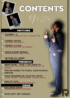
Old work (TOP) to new work (BOTTOM) - CONTENT'S PAGE'S


At the top as you can see in order from the Pri-Lim Task then after at the bottom is the recent task - My Music Magazine. You can see the difference between the old and new task's, before I wasn't confident with the program Photoshop. After having a go with producing the Masthead for the Pri-Lim Task I got used to the program having an tour around the different tools such as editing - drop shadow, inner shadow etc. The position of the Pri-Lim Task Masthead is shown on the left hand side, for my Music Magazine Task I wanted to place the word 'CONTENTS' near to the right hand side at the top while I included two images of two male individuals to make the top half look more attractive and different. I kept the scheme the same through out the Front Cover to the Content's Page the same using similar colour to blend well together.
(FRONT COVER IMAGE)


On the left hand side was the Pri-Lim Task and on the right hand side is the Music Task.
The difference between the two image is that one has a book in their hand but the Music task hasn't got any props in the image. The left image has a nature view background but the right image has a plain background, I wanted to attention to focus onto the artist not over crowed with other props etc. Both imaged have eye contact with the viewers which to me is very important because it draws attentions between the image and the readers. It's as if the artist is convincing the readers/viewers to buy the magazine, but if I had to choose out of both magazines shown above, I would choose the right side magazine from the detail the artist is wearing; from the make-up to the watch and then the clothing she is wearing is well planned and thought of then the left hand side image.
The facial expressions are different from each other as the right image shows serious but sophistication look to her, looking glamorous and all done up to attract the male readers as well as being a role model to be look up to by the young female ladies.
(CONTENTS IMAGE) - Pri-Lim Task

(CONTENTS IMAGE) - Music Magazine


TEXT OF THE (Contents Page) on the LEFT is the Pri-Lim Task, on the RIGHT is the Music Task


(CONTENTS IMAGE) - Pri-Lim Task

(CONTENTS IMAGE) - Music Magazine


(DPS IMAGE) - Music Magazine

LAYOUT OF THE (Front Cover) on the LEFT is the Pri-Lim Task, on the RIGHT is the Music Task

LAYOUT OF THE (Contents Page) on the LEFT is the Pri-Lim Task, on the RIGHT is the Music Task


LAYOUT OF THE (DPS)

FONT USE OF THE (Front Cover, Contents Page & DPS)


TEXT OF THE (Front Cover) on the LEFT is the Pri-Lim Task, on the RIGHT is the Music Task


TEXT OF THE (Contents Page) on the LEFT is the Pri-Lim Task, on the RIGHT is the Music Task


